Railfreight Design Guide, British Railways Board, London, 1988
Railfreight Design Guide, British Railways Board, London, 1988
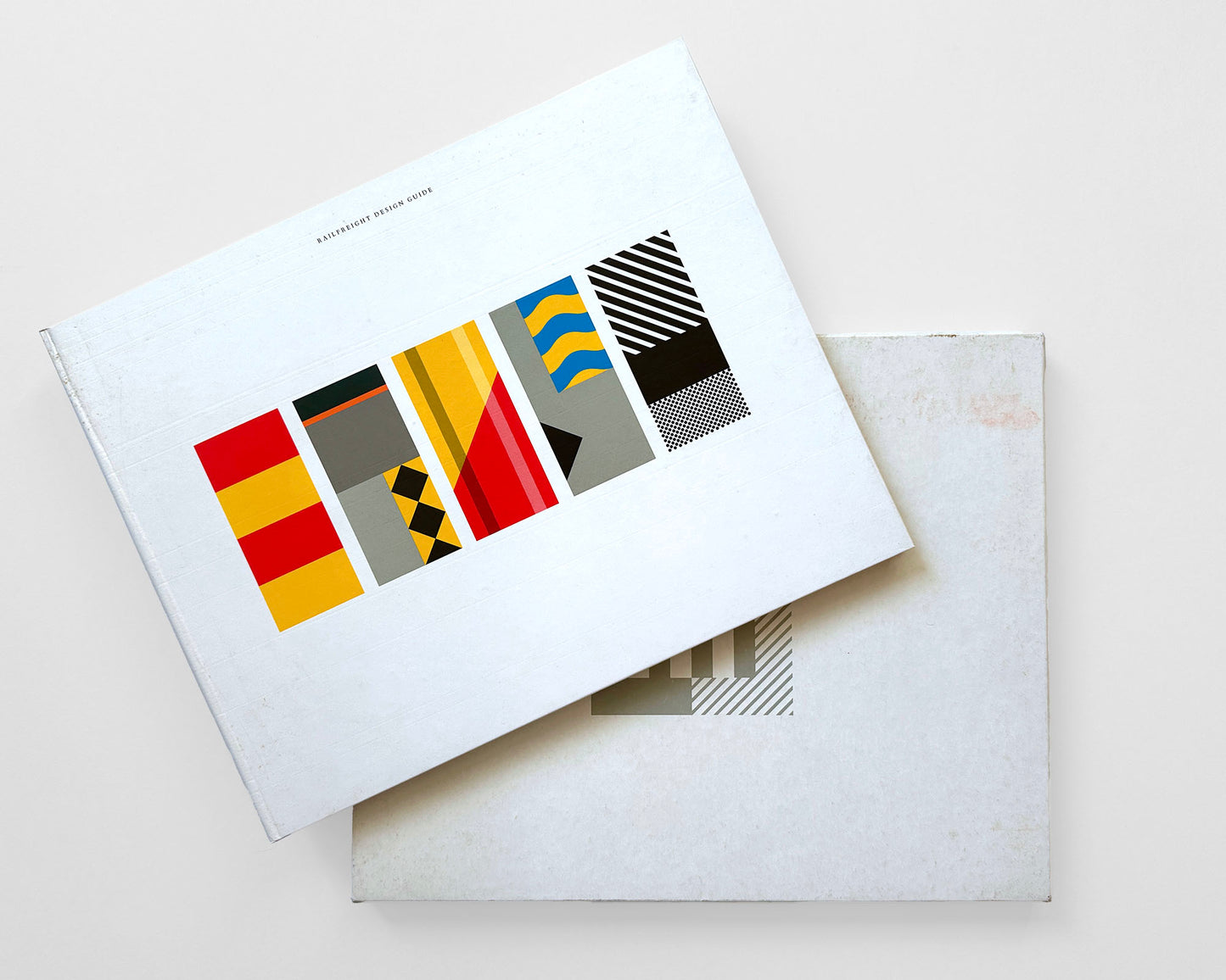
Railfreight Design Guide, 1988. British Railways Board, United Kingdom, London. 88 pp., 12.25 x 10, hardcover with slipcase. Printed in the United Kingdom and stamped “1070” on the rear yellow end paper; in an unknown edition. The original identity from 1987 was designed by Roundel Design Group.
“Britain’s railways of the 1980s were a mess, figuratively and physically. Grimy trains streamed in and out of depots, through under-invested stations and between industries just about grappling with the new global economy in which they found themselves. To many, including British Rail’s clients, things were not looking good." — Tim Dunn, Creative Review, 2018
A Foreword by Colin Driver, Director of Freight ... “The time had come for a powerful public expression of confidence: the time had come for a bold new corporate identity.”
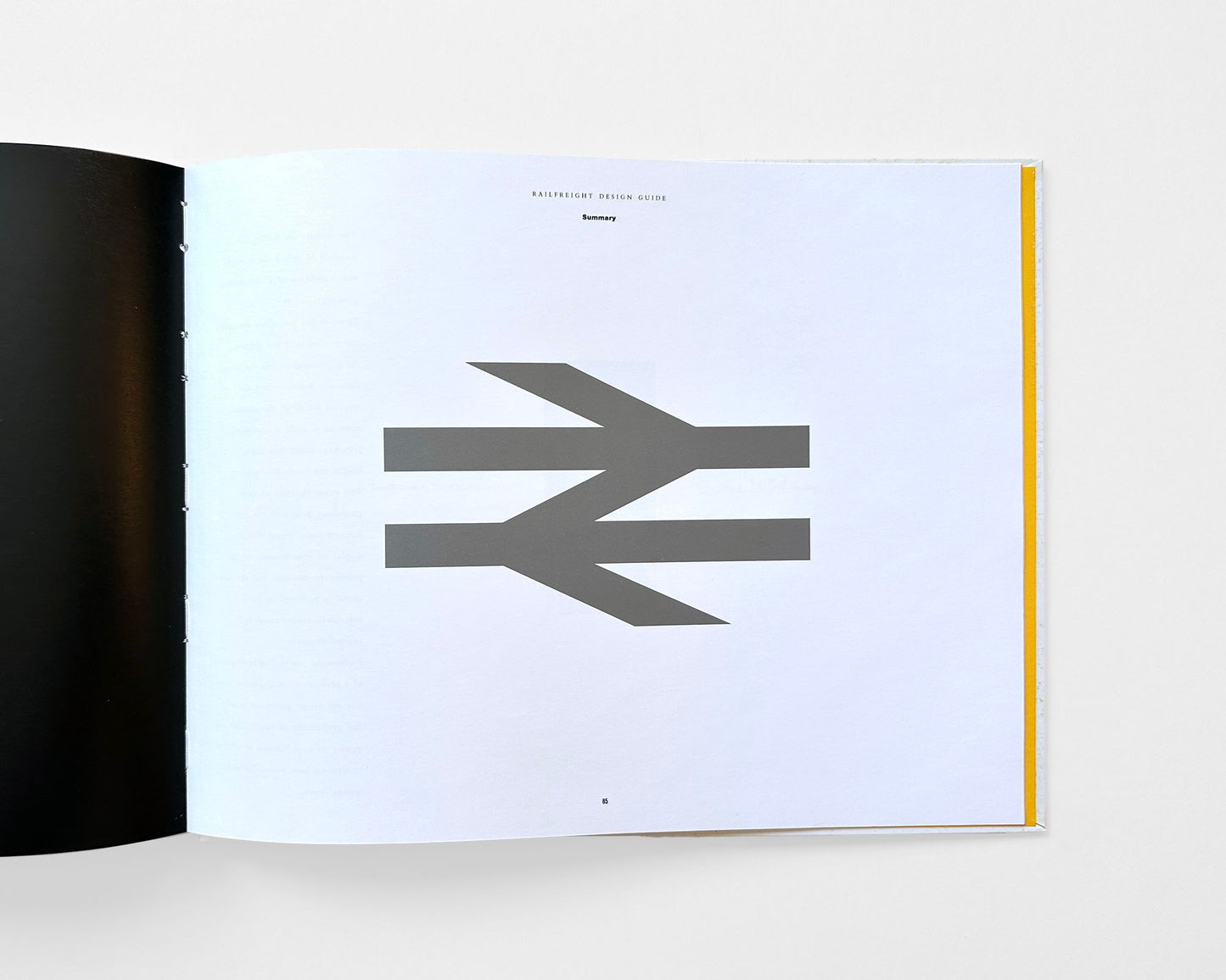
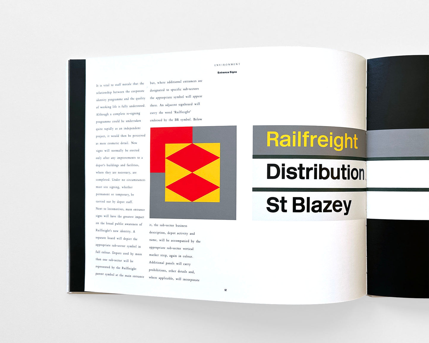
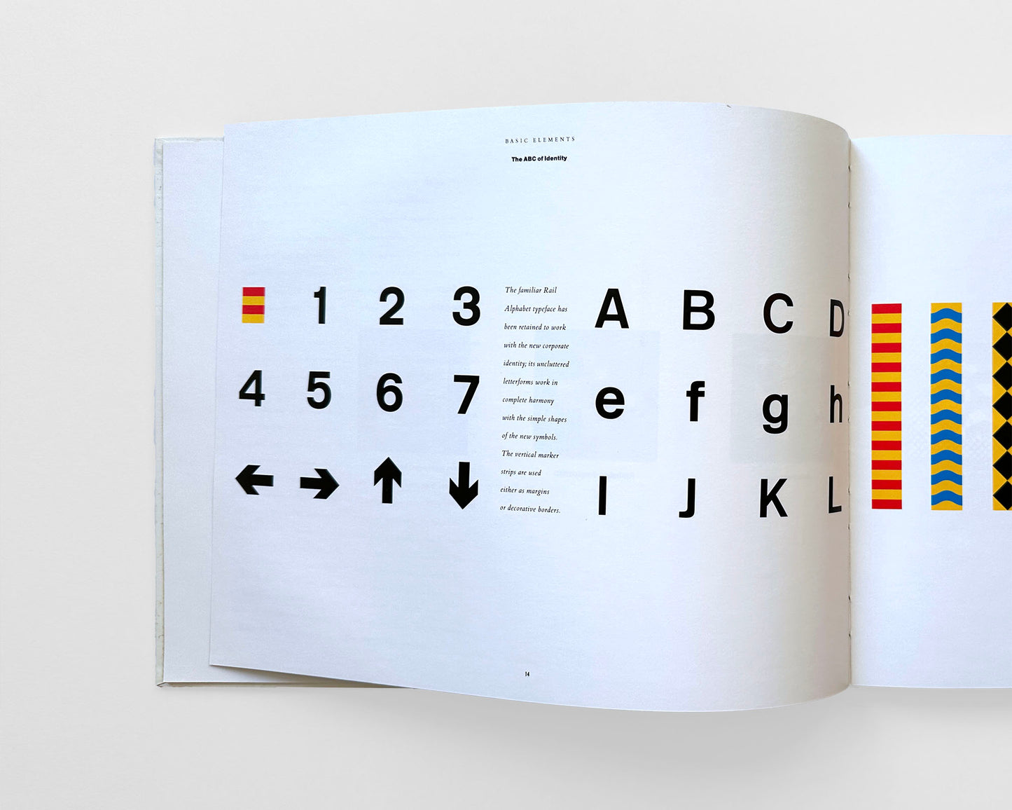
This volume expresses the spirit of Railfreight’s new, modern identity; and less of a rigorous standardized guideline. Included are Introductions and explanatory texts for all sections featuring: Basic Elements (Parent Symbol, A Symbol Sub-Divided, The ABC of Identity, Grey Areas, Depot Plates); Locomotives (Anatomy of a Locomotive, Livery Details, Painting, Symbols on Vinyl, Anatomy of an Identity, Cast BR Plates, Locomotive Data); Wagons & Vehicles (Box Wagons, Coat Wagons, Private Industry, In the Hight Street, Road/Rail Link, Wagon Data); Environment (Entrance Signs, Directional Signs, Industrial Landscape, Working Environment, Locomotive Cleaning); and Communications (Stationary, Brochure, Leaflets & Collateral Items, Promotional Items). A short Summary by the Director of Architecture, Design & Environment and Contacts at the end. With colored graphics and photographs throughout.
A very good hardcover with light wear, mostly to the front white cover. In its' very good slipcase with some soiling, a few blemishes and a small crack to one corner. Interior pages are bright and clean.
Couldn't load pickup availability
Share


- Choosing a selection results in a full page refresh.
- Opens in a new window.


