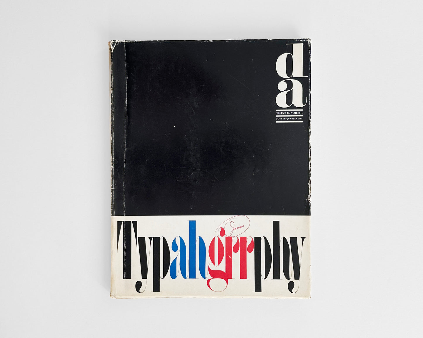
Special Issue Theme on Typography : Typahgrrphy cover by Herb Lubalin and Tom Carnese
Special Issue Theme on Typography : Typahgrrphy cover by Herb Lubalin and Tom Carnese
d/a, The Paper Quarterly for the Graphic Arts, Vol. LI, No. 4, Fourth Quarter, 1965. Paper Makers Advertising Association, Westfield, Mass. 8.625 x 11.125, pp. 27 devoted to the special theme: Typography followed by numerous pages of paper samples and trade advertising.
The Typ-ah-grr-phy cover is design by Herb Lubalin with lettering by Tom Carnase (perhaps the later released LSC Condensed).
Uncommon. This special issue is devoted to Typography and features excellent articles, well illustrated with black and white examples: About our cover designer (Herb Lubalin); Typography and paper and Typography and change by the editors; The best typography never gets noticed by Herb Lubalin; Typomundus 20 by Klaus F. Schmidt; Computer typography ... a progress report by Jack Turchon; A new typography by Aaron Burns; Design styles produce type trends by Freeman Jerry Craw; and Editor of d/a retires.
The excellent Typ-ah-grr-phy cover uses onomatopoeia or sound to the letters. In Lubalin’s article: ”The best typography never gets noticed” he states: ”The reader is affected subconsciously by the intricacies of design and type even though he is totally unaware of them.” And ”The moment the reader becomes aware of typographic characters instead of words, he doesn't get the message.”
A good, vintage magazine with a long vertical crease and wear to the yapped cover edges and spine. With a red ink circled annotation “Jonas” to the front cover above the letters “grr”.
Couldn't load pickup availability
Share

- Choosing a selection results in a full page refresh.
- Opens in a new window.

