John Deere Corporate Identity Manual
John Deere Corporate Identity Manual
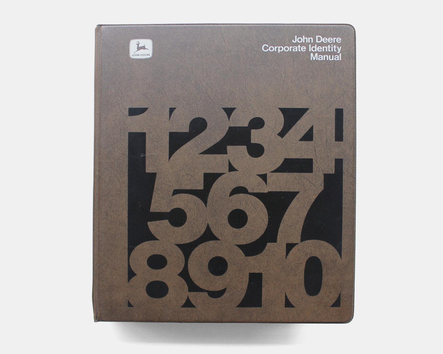
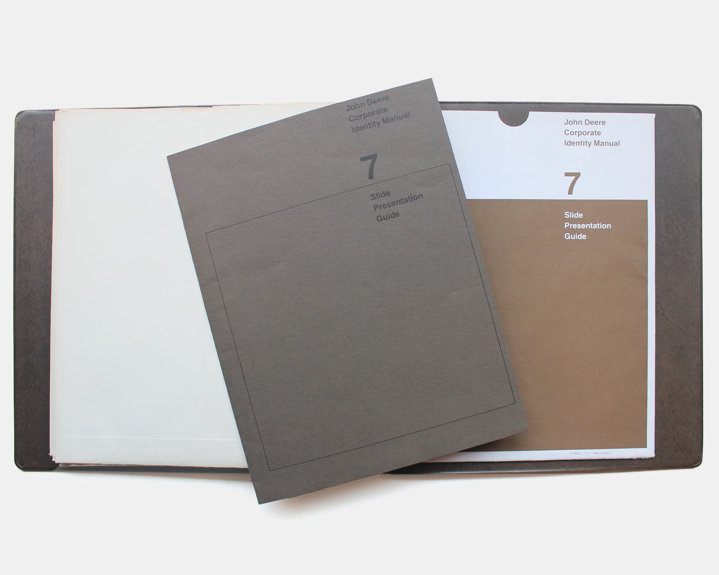
John Deere Corporate Identity Manual, c. 1972-80. Deere & Company, Moline, Illinois. 10.25 x 11.5, ring binder, loose-leaf system with (8) individual folders. Designed by Deere & Company Advertising Department.
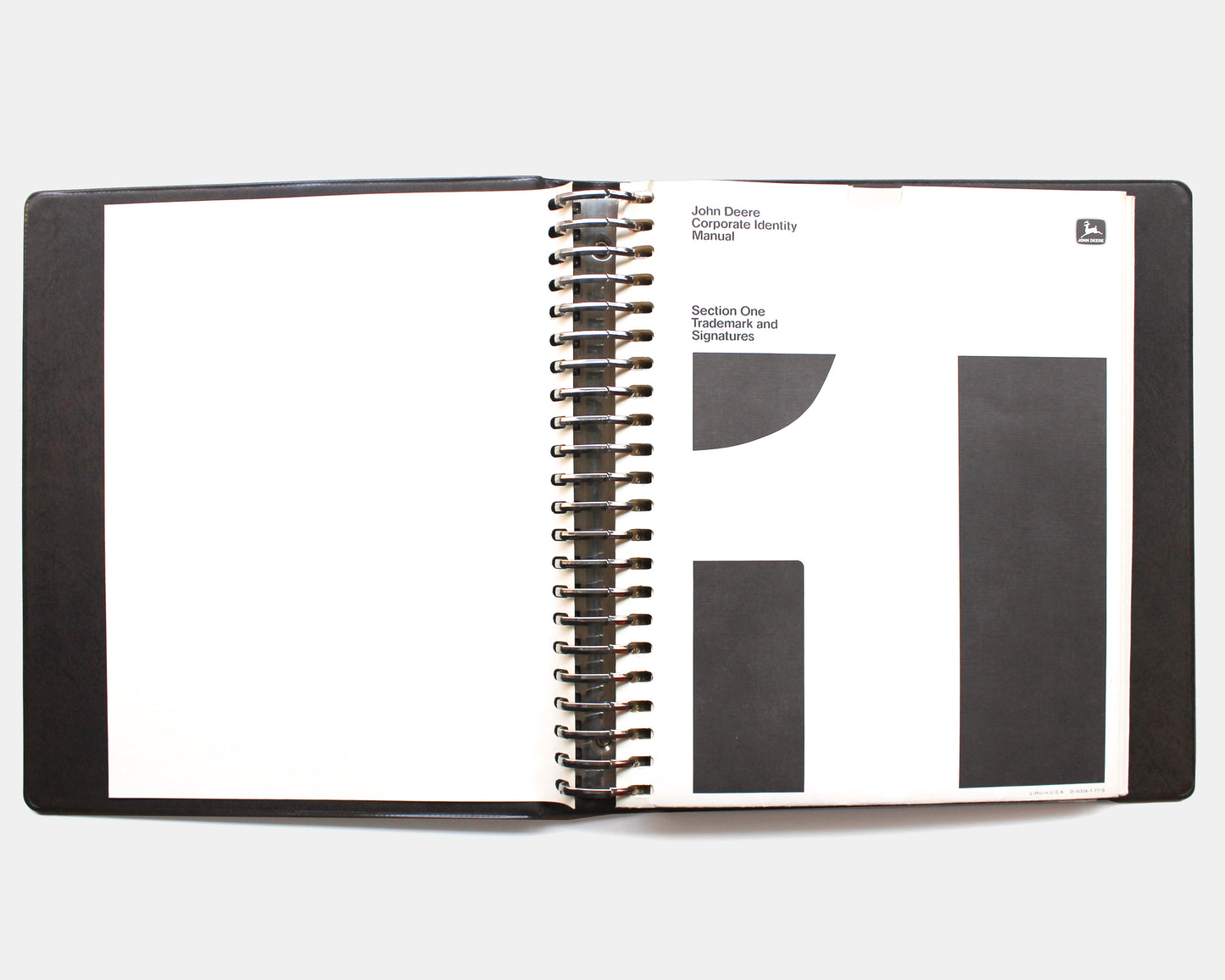
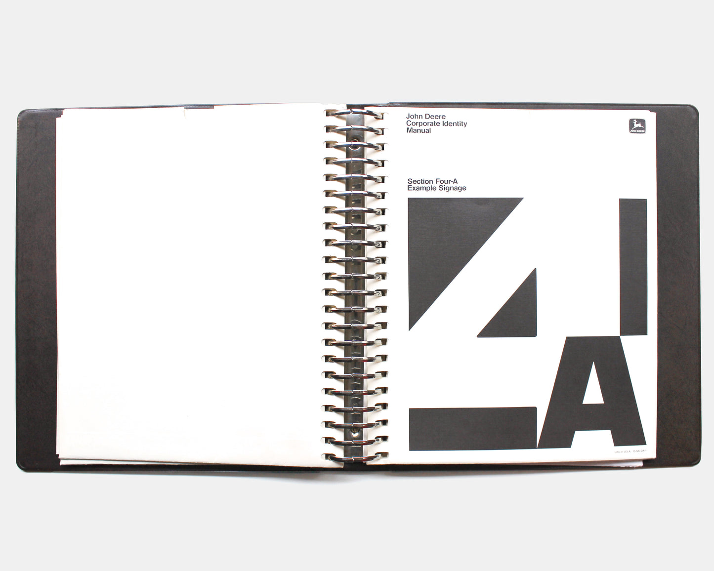
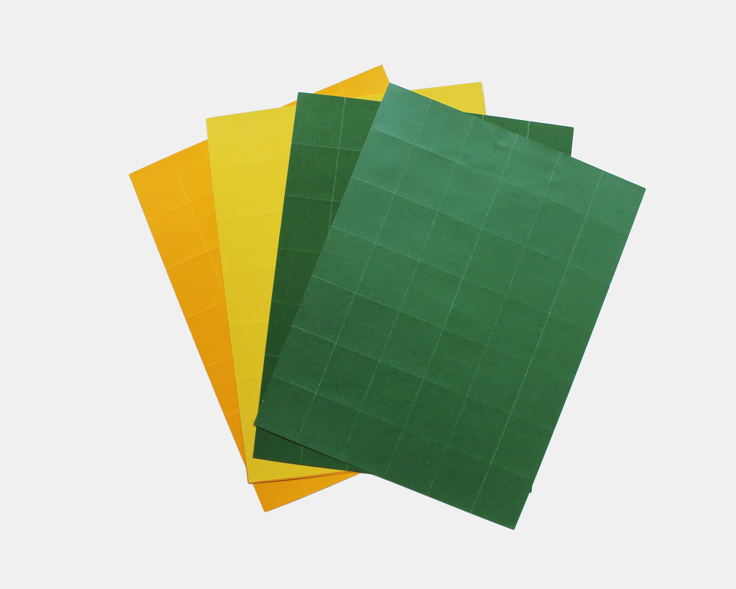
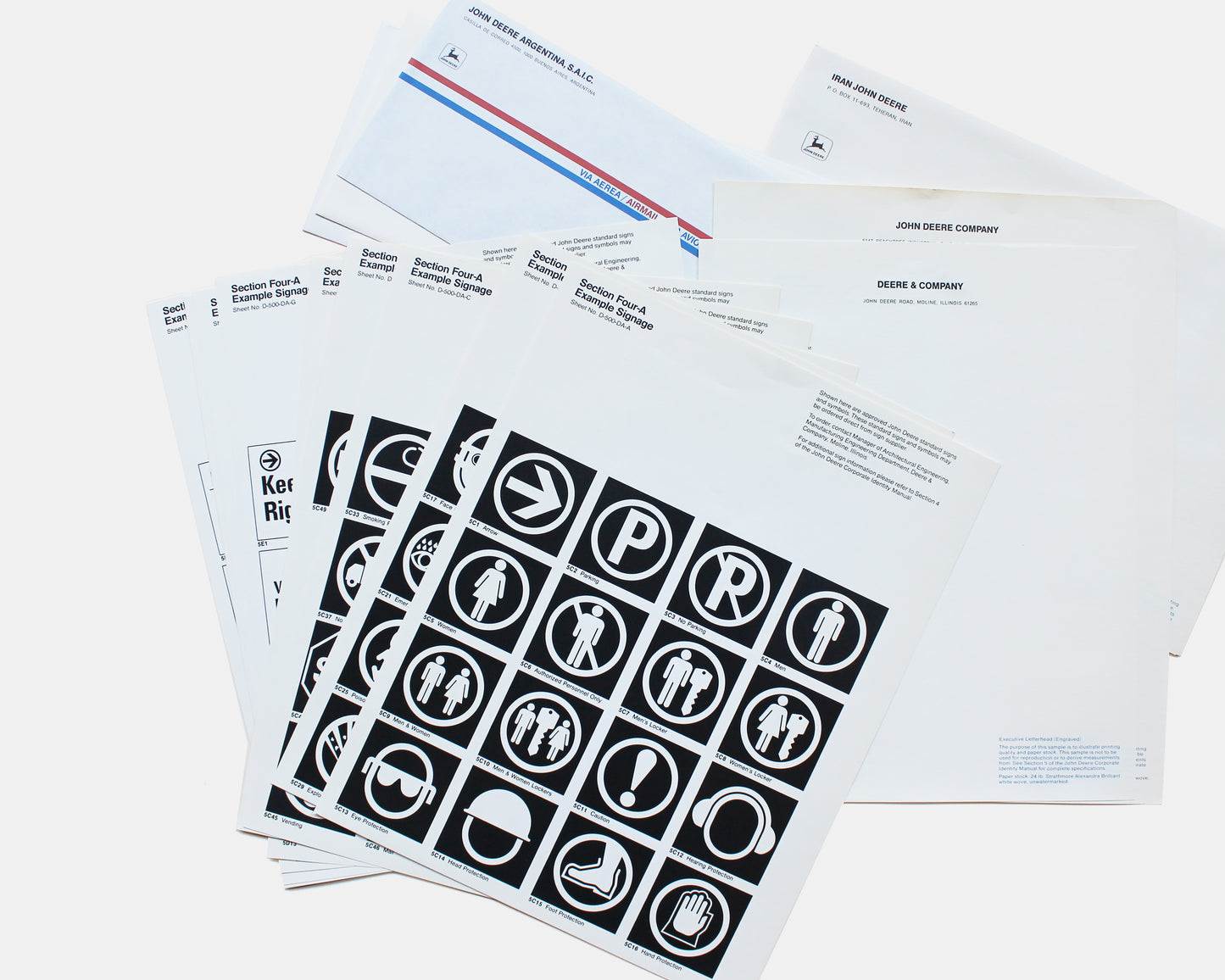
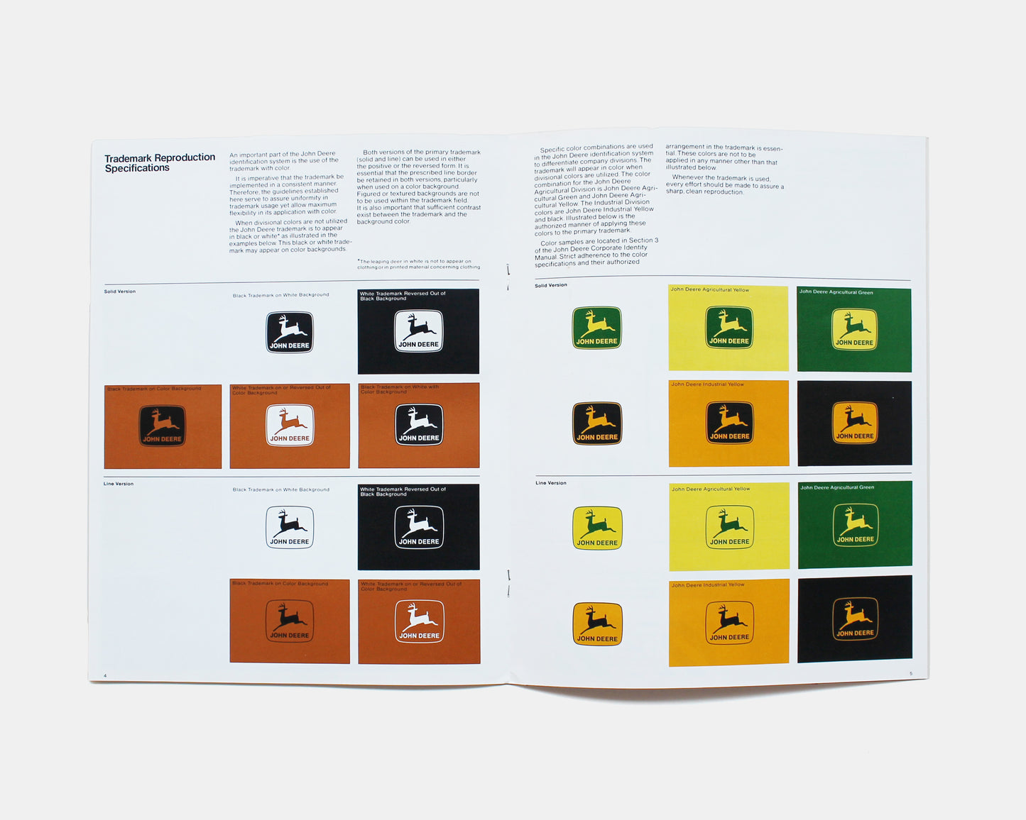
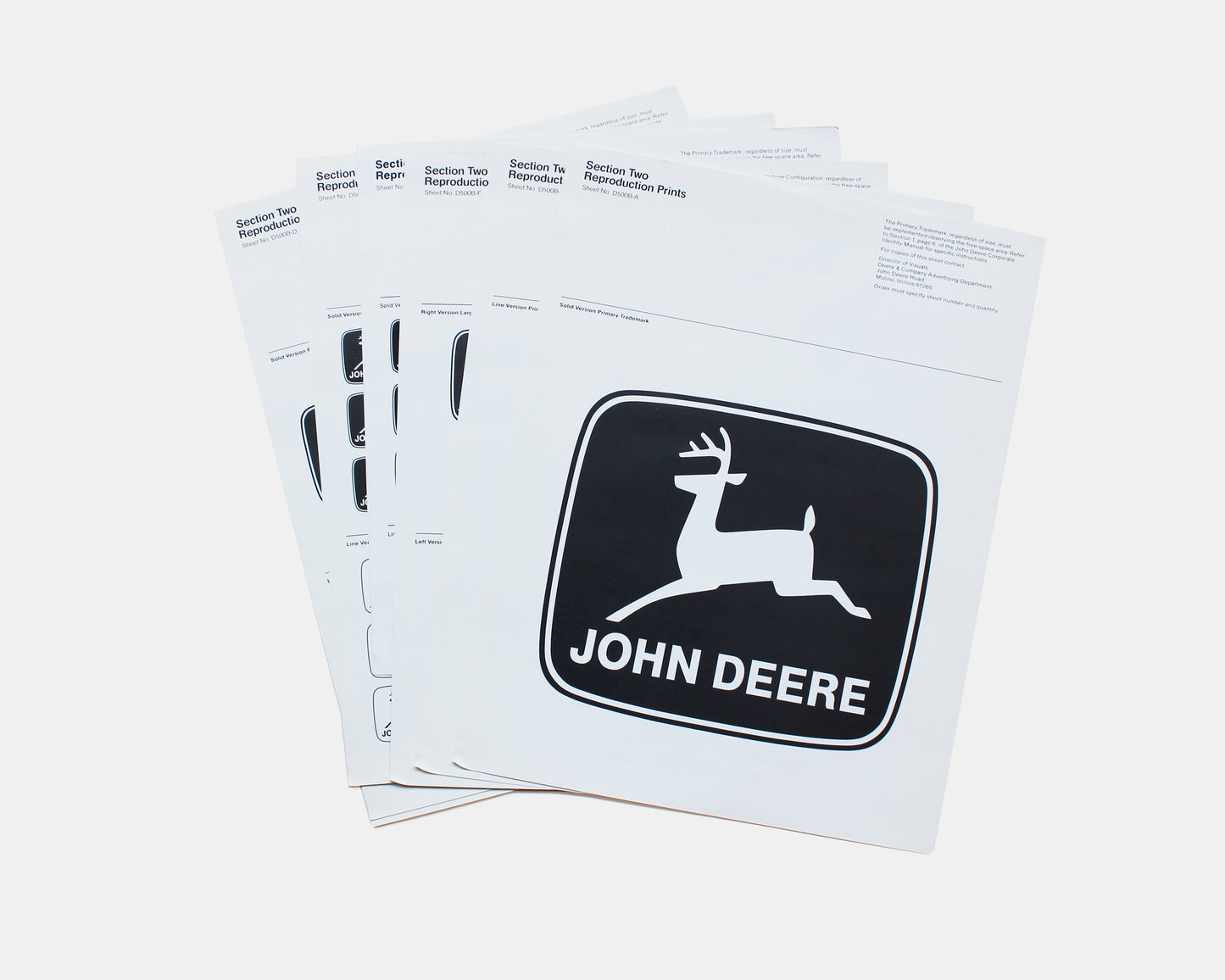
An original John Deere Corporate Identity Manual "to establish guidelines that will help assure that this visual impression is favorable and consistent and reflects a modern and progressive company." Foreword by William A. Hewitt, Chairman of Deere & Company and seven individual folders or sections containing either loose single sheets or stapled booklets printed in black and white and color. : 1. Trademark and Signatures 2. Reproduction Prints, 3. Color Standards (perforated color swatches), 4. Signs, 4-A. Example Signage, 5. Stationary, 6. Stationary Samples and 7. Slide Presentation Guide. Interestingly, there is no section devoted to typography, although Univers 67 (Photo Typositor) is identified as the alphabet used for the signage program.
In 1968, the John Deere logotype was designed by Robert Vogele (RVI Corporation). It used custom lettering based on the Helvetica typeface. Additionally, the deer image was streamlined to show a straight-side silhouette with only two legs and one four-point rack of antlers. This manual appears to be using the same styles.
Nearly fine with only light handling. One of the Reproduction Prints sheets has been used and includes cut outs.
Couldn't load pickup availability
Share
- Choosing a selection results in a full page refresh.
- Opens in a new window.


